
How to Set Up Affiliate Landing Pages (Examples + Templates)
The goal of a great affiliate landing page isn't just to drive clicks to your affiliate offer.
You want to attract an audience that's ready to buy, trusts your recommendations, and spends more than the minimum. From there, the copy, images, and layout all play a key role in priming visitors for a conversion.
Want to discover the ideal structure for an affiliate landing page and how to optimize yours, based on real-world examples? Read on to learn:
- What is an affiliate landing page?
- Tips for building affiliate landing pages that convert
- Affiliate landing page examples
- Affiliate landing page templates (Our 2 favorites)
What is an affiliate landing page?
An affiliate landing page is a page on your website where you send traffic with the goal of driving your visitor to click and convert on an affiliate offer. Traffic to your landing page could come from organic search, social media, email newsletters, paid advertising, or numerous other sources.
Your affiliate landing page itself can take the form of an optimized blog post (such as a product review or product roundup) or a dedicated landing page, created for a single campaign. You can build them in WordPress with built-in blocks, or using a landing page builder.
Here's an example of a simple landing page for affiliate marketing by Wirecutter:

In this example, Wirecutter features its top picks for time-sensitive affiliate deals, right above the fold. It also offers readers the chance to join their Daily Deals newsletter, so they can send them more deals (and affiliate offers) on a daily basis.
This brings us to the next consideration: Funnels for affiliate marketing.
Affiliate landing pages can also be part of a larger affiliate marketing funnel. In that case, affiliates collect email addresses in order to warm up the prospect by sending educational emails, which helps them make an informed purchase by the end.
Funnels work great for high-ticket affiliate offers with a longer, or more complex buying process.
But in this post, we'll be talking about simple affiliate landing pages that drive visitors to purchase your affiliate offer directly.
Here are 4 tips for improving conversion on your affiliate landing page, from top to bottom.
How to build an affiliate landing page that converts
Tip 1. Earn your click with a great headline
A high-converting affiliate landing page is pointless unless you can get people to click-through to it. And that's where your title text comes in.
There's an adage in copywriting that you should spend 50% of your time on the content, and the other 50% on a headline. It sounds like a lot, until you remember that despite what Google says, click-through rate is probably a ranking factor.
This is why it's so important to have a great title for your affiliate landing page. Here's an example:

SEO isn't the only way people are likely to find your content. That's why earning a click on different platforms require different strategies. Here's an important tip for re-using a single landing page across multiple platforms.
TIP: TAILOR YOUR TITLES TO THE PLATFORM
You don't have to use the same title everywhere. Paid ads, organic search results, and social media platforms all have different patterns and best practices for titles that earn quality clicks.
For example, here's an example of how lifestyle brand The Everygirl switches up its social media and SEO titles:

- Social Media: Our Beauty Editor's Cult-Favorite Skincare Essentials Are on Sale RN
- SEO: Our Beauty Editor is Losing It Over Dermstore’s 25% off Sale
Even though they want to rank for "Dermstore sale", they opt for the more enticing term "Cult-favorite" to drive interest (and clicks) from Facebook.
Tip 2. Link to your offer early in the content
This is of the biggest affiliate marketing mistakes I see time and again. Too often, affiliates waiting until too late on the page to actually link to their affiliate offer.
You don't need to cram a link above the fold for the sake of it. But you'll notice that many of the most successful affiliate websites do just that.
Here's an example of an affiliate landing page which does this:
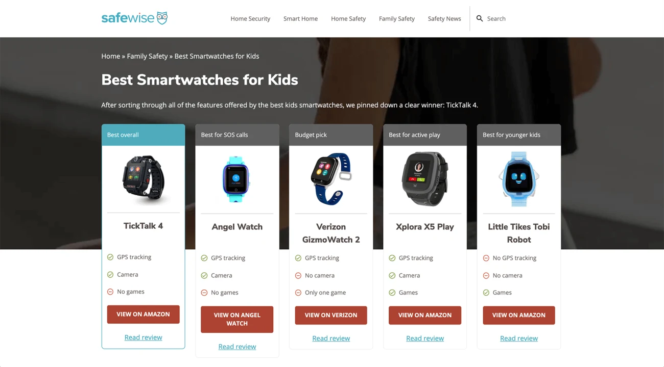
The reason it works is that many readers are curious to learn more about a website's top pick. That's why, the first affiliate link on your page usually generates the most clicks.
In this example, SafeWise is linking to the best smartwatches for kids. "Best Overall" is the highlighted category, with a number of alternatives that are better across a variety of metrics that might matter more to the individual customer.
The buttons contrast nicely with the otherwise simple design of the page. This makes it easy to see exactly where they want readers to click. This design is re-used on a number of pages, which is a good signal that it's a high converting affiliate landing page layout.
Tip 3. Run on-page tests using specialized affiliate tools
Small tweaks can take a landing page from a handful of sales to driving significant revenue.
But you need to be able to attribute your conversions back to which on-page strategies (such as your links, buttons, and images) are actually responsible for them.
You can use a dedicated affiliate marketing tool for publishers like Affilimate to track this. Affilimate's Conversion Heatmaps help you figure out which affiliate marketing strategies in your content are leading to actual revenue.
For example, whether you're earning most of your revenue through text links:

Then, once you make a change to your page, Affilimate will start tracking new clicks and sales to a separate version.
So you can find out whether your optimizations actually made a difference — not just in terms of clicks but affiliate income. Once you know for sure a specific strategy is working, it's simple to scale out across more of your landing pages.

Here are three ideas for tests to run on your affiliate landing pages:
- Add a comparison table with alternatives. Similar to the example we saw with SafeWise, adding a comparison table to your landing page can be useful for visitors — and drive a ton of clicks.
- Increase your affiliate link density. It's not enough to link once or twice to your affiliate offer. Visitors could decide at any point that they want to check out the offer for themselves. May it easy by linking often, without going overboard.
- Increase the color contrast of your CTA buttons. Choose a color which contrasts with the website. Avoid using the brand color if this is present elsewhere on the site. For instance, if a website is mostly black, white, and blue, choose a warm CTA button color like red or orange.
To the last point, here's an example of why I wouldn't recommend coloring your CTA buttons in your main accent color:

This page leans too much on the brand's blue color. Your eye is drawn to the navigation, and to the table header, but not to the affiliate links themselves.
Changing these links to a warmer color would be a really low-effort test, which would likely boost the click-through rate and revenue per visitor.
Tip 4. Include social proof
Customers rarely rely on a single opinion before making a purchase. They scour review websites, read reviews of customers like themselves, check customer-submitted product images, and more.
Looking to the opinions of others in order to form your own is known as relying on "social proof".
To keep customers on your landing page — and provide them all the information they need to make a buying decision directly on your website — you've got to include social proof, too.
Here's an example of social proof in action on Themeisle's review of the popular WordPress plugin, Elementor:

Including metrics like "5,000,000+ installs" and "94% ratings" are both ways to indicate, "Other people had success with this product, and so will you."
Here are more examples of social proof you can include on your affiliate landing page:
- Testimonials from happy customers. For example, "One customer review I read before buying [product] said, 'This changed my life.' and I agree."
- Screenshots of reviews from the advertiser's website. As long as it's allowed under the website's terms of service, you can screenshot compelling reviews and include them directly on your landing page.
- Your own images, such as before and after photos. Few things are as powerful as sharing your experience, using words like "in my experience", "personally", and "personal recommendation."
- Statistics and studies. Similar to ratings, statistics and studies can help customers feel confident they're about to make a wise, data-backed purchasing decision.
- Website comments or emails and messages from readers. If your website allows comments, you can even feature comments by satisfied customers in your content itself.
Affiliate landing page examples that convert
Here are a few examples of successful affiliate websites with carefully crafted landing pages. I'll go through each one and share what they're doing right, why it works, and possible improvements they could test to boost conversion.
You'll see examples of three main types of affiliate landing pages:
- Product Reviews
- Product Roundups
- Tutorials
Example #1: Lucy's List (Product Reviews)

Lucy's List is a popular website in the parenting and baby niche. They have tons of reviews for products like strollers, car seats, and tons of other baby gear.
Lucy's list has a common product review template they follow for every article. It starts with a hero section, product image, and a "Buy now" button in teal with more buying options listed below. The authors face and title is clearly visible, which makes the review more credible — readers know they're getting advice from a fellow mom.
Even though the teal affiliate CTA competes with the red one for newsletter signup, this is on purpose. Lucie's List has over 450,000 subscribers, and undoubtedly generates a ton of repeat purchases through email affiliate marketing.
Example #2: Headphones Addict (Product Roundups)
Headphones Addict is a niche website dedicated to, well, headphones. "Best Headphones for X" is their most popular content format. They've written about headphones for sports, for the office, and for just about any other situation you can imagine.
As I mentioned before, they do a great job of including links early in their affiliate landing page, inside a comparison table. Even better would be if the comparison table fit on the screen, without a horizontal overflow.
Example #3: Safewise (Product Roundups)
Safewise is a site in the home security niche, and does a combination of reviews and product roundups. They collect and review products in categories like smart home technology, family safety, and safety news and statistics.
As I shared earlier, Safewise usually manages to fit a lot of their initial affiliate CTA buttons above the fold. Paired with a clear indication of the "Best Overall", it's safe to say this design drives clicks early and often in this post.
Example #4: BuzzFeed (Product Roundups)

BuzzFeed has become a household name, and has broken their brand into numerous sub-brands they use to promote different kinds of products and reach distinct audiences.
One such audience is known as BuzzFeed Shopping, which is where they promote these product roundups on a regular basis. Like a lot of examples in this list, they include a summary at the top of the page of the most popular products recommended.
This helps drive early clicks and place an affiliate cookie as soon as possible. Readers are then welcome to take in the rest of the mini review below each product in the list.
Example #5: Themeisle (Product Reviews and Tutorials)

Themeisle is a website that offers WordPress themes, but also focuses on other aspects of the WordPress ecosystem like website hosting, email marketing tools, and other kinds of plugins. Though they have an entire section dedicated to reviews, just as prominent is their section on "Popular guides".
Most of which, are tutorials that teach people how to use products that Themeisle is an affiliate for. A quick search shows that they've written over 270 "How to" articles:

This is even more than the number of reviews on their website — a strong signal that tutorials as affiliate landing pages is working great for them.
Affiliate landing page templates: Our two favorites
Before we wrap up, I want to share two tried-and-true affiliate landing page templates you can use for your next piece of affiliate content.
1. Product Roundup Template
A product round up is an article on your blog, a social media post, or an email that features several products in the same category or according to a theme. As the reviewer, it's your job to evaluate each product and help your readers make an informed buying decision.
Done right, product roundups not only drive excellent affiliate commissions, but are genuinely useful to your audience.
Further reading: How to Write a Great Product Roundup Review Article in 5 Steps

2. Product Review Template
A product review is typically an article where an expert gives their opinion about a product, reports on its performance, and ultimately makes a recommendation about whether or not to purchase it.
Product Reviews are a classic example of content for affiliate marketing, and can be profitable (albeit competitive) to rank for organically.
Further reading: The Simple Product Review Template That SELLS in 2023

Wrapping up
A great affiliate landing page doesn't have to use a ton of complicated WordPress plugins, elaborate website builders, or take hours of reading tutorials to create.
The truth is, an effective affiliate landing page's main ingredients have little to do with technology:
- A clean design with quality images and a strong CTA button
- Compelling copywriting, backed by social proof
- And of course, an affiliate product that converts
But unless you are doing some kind of affiliate tracking, you'll have a hard time knowing which piece of the puzzle isn't doing its job.
If you're looking to build or optimize an affiliate landing page, you can try Affilimate free for 15 days. No credit card required.
Run an experiment, and see if you can boost your revenue per visitor!
