2024 Product Comparison Template (Expert Tips & Examples)
Tired of scouring through endless product reviews to decide on something like a smartwatch? So is your audience. Make their lives easier with this product comparison template.
Over 90% of shoppers read reviews before buying a product.
Can you blame them? Inflation’s hitting people hard, so they’re extra cautious about which brands get their hard-earned cash.
And while product descriptions and pictures offer a snippet of life with a product, they don’t come close to the value of first-hand experience.
But competition is fierce in every industry, so people find themselves browsing reviews from countless brands.
My boyfriend’s thinking of upgrading his smartwatch. So he’s been watching video reviews till his eyes bleed. And this weekend, it was multi-tools:
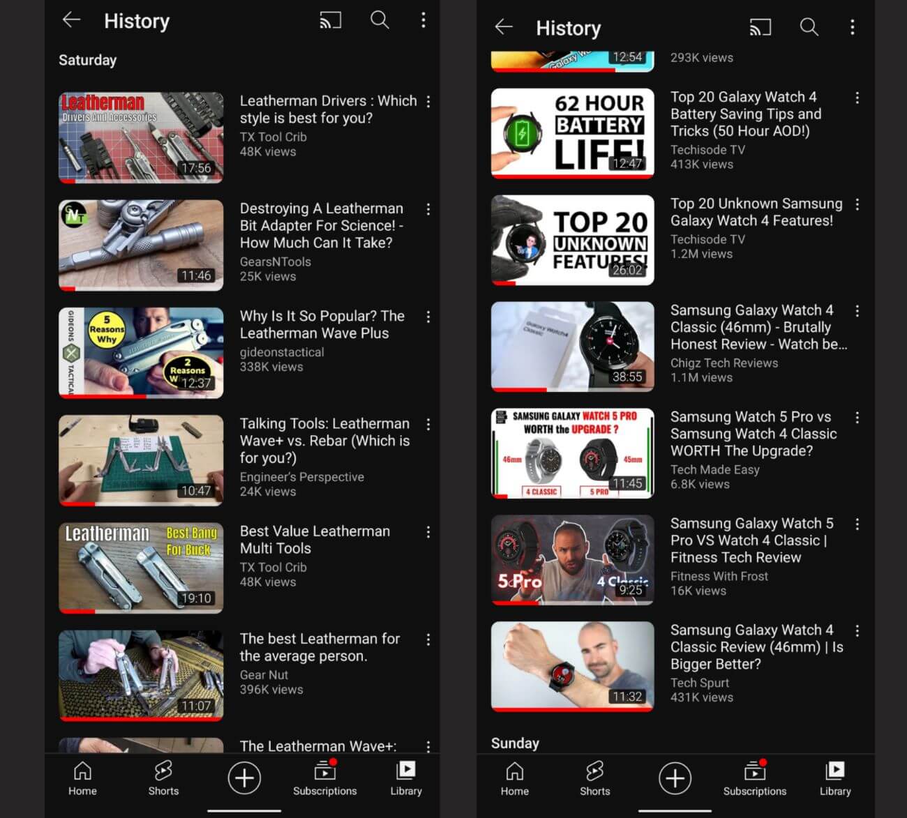
So despite all the online research, marketing experts remind us that product comparison becomes a “daunting task” for the average consumer.
That’s why product comparison websites and content are so valuable.
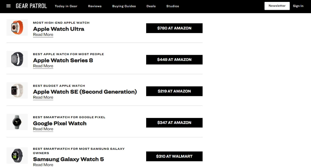
Check out this snippet of Gear Patrol’s product comparison for digital watches:
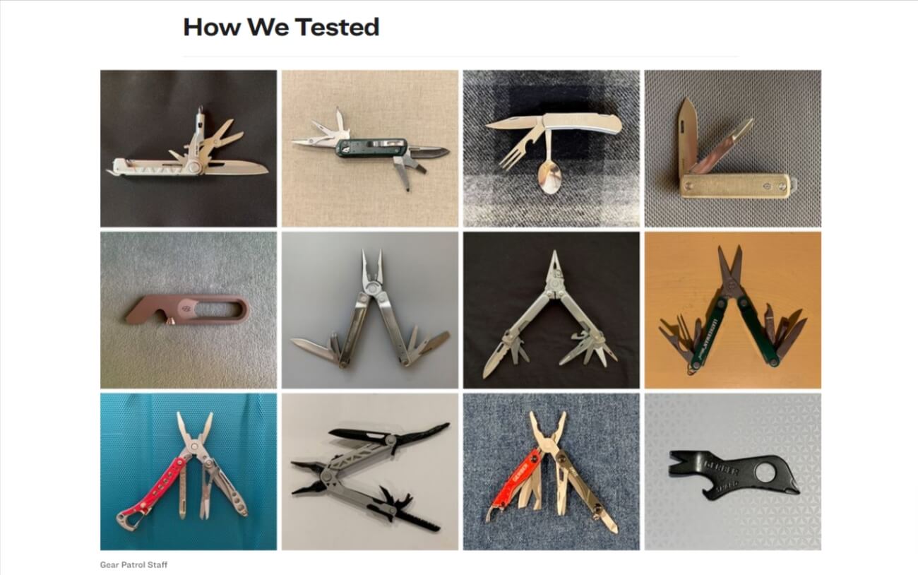
They also have one for multi-tools:
Similarweb estimates that Gear Patrol brings in $10–15 million annually with their product comparison content among other formats. But they put in the work – trusted templates, regular updates, audience research, and SEO are all vital for success.
We’ll walk you through our product comparison template, how to write ones that convert, and how Affilimate keeps the momentum going with performance insights and affiliate link management.
Product comparison template overview
The product comparison is a commerce content model that helps consumers close to the end of their buying journey choose between two or more similar products. It’s similar to the product roundup article, except the comparison provides more insights about one product’s advantages or disadvantages over others.
The best product comparison affiliate content is written by reviewers with first-hand experience using the product or by a writer who has provided some real-world accounts from other sources.
But there’s just as much value for the reader as there is for the publisher (that’s you)!
Product comparisons bring a world of opportunity (*cough* commissions) for today’s affiliate marketers. Imagine a product review, but with triple, quadruple, and even more opportunities for readers to convert.
So how do you craft product comparisons that people will actually find online? Let alone ones that people trust enough to guide their purchase?
Affilimate’s platform is based on data – we see what converts and what doesn’t when it comes to affiliate content, and we share those insights with our clients. This product comparison guide gives you the juice to engage, entertain, and convert your readers – then scale your business.
Product comparison template elements
Say you’re talking about two hiking backpacks. You might have a clear idea of which one you think is superior, so you start writing – but you’re really ranting. That’s not how product comparison content converts. There’s a formula you should follow if you want to see results.
Here’s the skeleton of your product comparison article:
- SEO-driven title
- Straightforward intro
- Product overview
- Product comparison
- Side-by-side product comparison table/chart
- Product pros and cons
- Differences between products
- TL;DR section of the review
- Buyer decision-maker conclusion
Note: some of the examples we use might have slightly different product comparison templates. Still, they closely align with our outline and offer the same value to readers.
1. SEO-driven title
Your product comparison title is the sophisticated outfit and bold lipstick you wear to make a good impression.
Here, your look = relevant keywords, and good impression = value for your reader.
Our advice? Use your title to summarize what they’ll get out of the article, aka your content’s impact.
Here are your title options for your product comparison template based on search phrases:
Option #1: Alternatives – Contrasting a bunch of product alternatives against one option
We love Byrdie’s title:

We’ve got “gel nail alternatives” for the keywords and “easy on nails” for reader value.
Next up for title formulas:
Option #2: Versus – Comparing two different products
Here’s an example from MattressAdvisor.com:

We’ve got keywords and a simple value point for the reader.
We also like this detailed SEO title from LetsTraveltoMexico:

We’ve also seen tons of product roundups that also include product comparisons within the piece. These titles might look like “10 Best Tools for X.”
These are great content pieces for SEO and affiliate links; however, you might miss out on some readers if they’re searching for specific comparisons in Google.
If you want to dive deeper into title formulas, check out this keyword strategy guide from Search Engine Journal.
2. A straightforward post intro
If you search for “best products comparison” you likely want a short, sweet introduction that tells you why these particular items are the ones to consider. iIn an intro, remember to briefly indicate the brands and products you plan to compare.
Android Authority does a pretty good job with this intro:

This intro has the whole package: brevity, engagement, and a touch of subjective thought to help with core ranking.
Next up:
3. Product overview
With a product overview, you’ll want to situate the item in the context of a broader idea or trend to help your reader truly understand what they’re buying. Keep it short and sweet with a paragraph or two under separate headings for each thing you’re comparing.
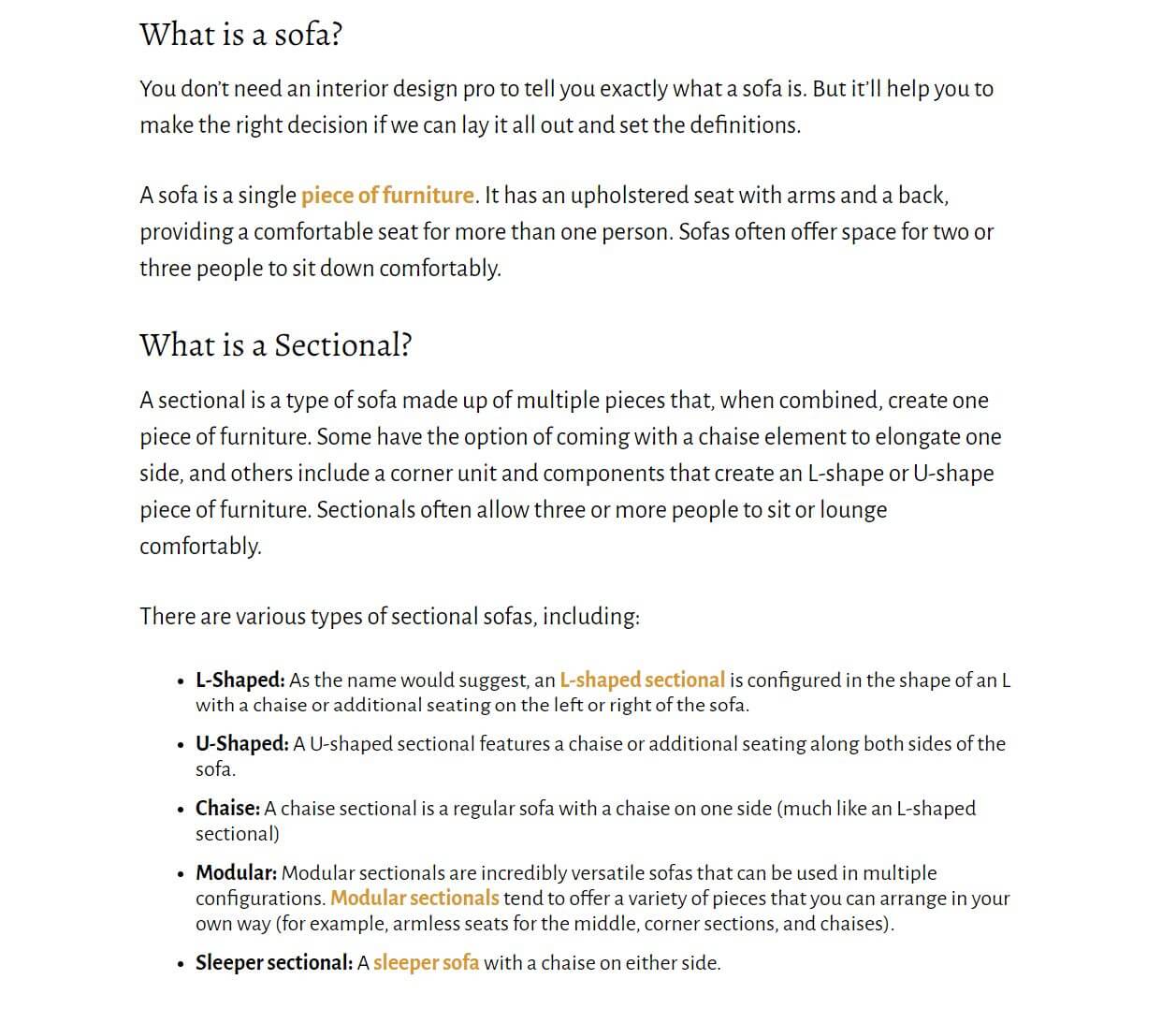
Since Livingcozy.com is comparing different types of products, the “what is” product sections make sense. But if you’re comparing products that have the same function and just a different brand or model, it’s better to highlight features.
In that case, a quick product snapshot might make more sense:
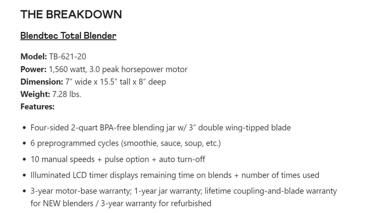
We love this second example because it packs essential details about the product without feeling overwhelming or long-winded. Key features, model, dimension, weight, and power are all relevant details a reader might want to know about the product.
But the real intrigue comes in the actual comparison.
4. Product comparison section
This is the meat of your article. Your readers will look here for important details to help pick the best product for them.
If you think a 1,000-word set of paragraphs is enough to impress, your product comparisons probably need some work. You need to appeal to the skimming, time-pressed, fast readers with dynamic storytelling and formatting. We recommend using lots of headers, bulleted lists, summaries, visualizations, and, of course, CTAs to encourage a purchase.
Here's what your main content body should look like:
Side-by-side product comparison table/chart
Your product comparison article could be thorough, engaging, and fabulous overall – and people still won’t read the whole thing.
Indeed, Hubspot found that 73% of people only skim blog posts. This means you need to give your readers an easy way to quickly digest your comparison.
The Spruce offers a final product comparison in two paragraphs in the conclusion of this piece on wood flooring options:
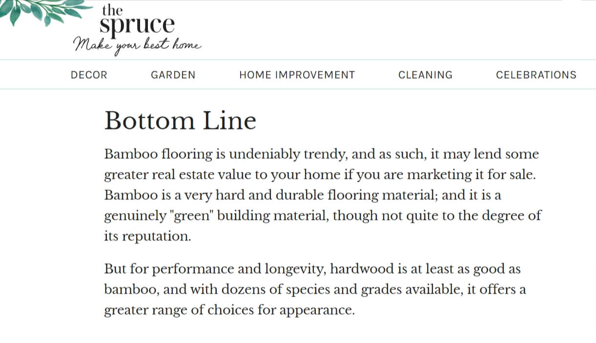
Our take? This is more of a “too long, didn’t read” (TL;DR) section (more on that later). The Spruce might have caught the readers who scroll down to the end, but paragraphs fall short in visual appeal for direct comparisons.
Readers want to see appealing visualizations displayed side-by-side, showcasing each product's features and benefits.
Monica Lent, founder of Affilimate points out:
Without a product comparison table, you’re leaving serious money on the table.
One of our favorite product comparison examples of visualizations is this appealing, skimmable overview by MattressAdvisor:
But you’ll need to master your site’s UX to slam-dunk with a comparison table. All too often, we see tables that come off the page or, worse, look bad on mobile:
Shelley Marmor, founder of TravelBlogging101 and multiple additional travel blogs:
I could not find a comparison table that looked nice on both desktop and mobile, so I made my own.
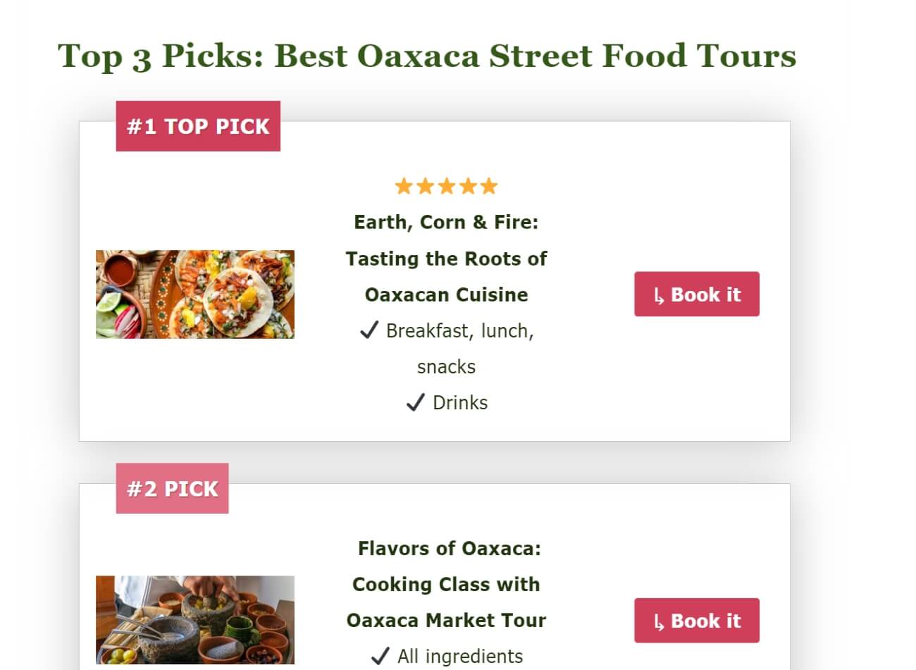
Marmor improvised but still offers the reader a clear comparison in an alternative format. We love that brevity does not sacrifice value here!
It has now become the second biggest point of conversions in my affiliate articles, pretty much across the board – and I saw results immediately.
So how could Marmor see those effects? Affilimate’s affiliate marketing dashboard shows her exactly which links bring her conversions on her site – and heat maps tell her where her audience is clicking.
But the most important question: What did Marmor’s readers think?
I think the simpler we can make it for the reader in an affiliate article, the easier it is for them to choose.
This is why I made the tables simple: just an image, qualifier like ‘#1 Top Pick,’ and a few bullet points that showcase what makes it a top choice.
We know, we know – tables can be a hassle. But a little initial work brings rewards down the line.
It took about 3 hours to make the table.
But now that I have a template, I use it across all my affiliate articles. I saw an increase in sales as soon as I started using them.
Pro tip: Don’t start writing your comparison chart until you’ve mapped out all the differences between the two products. We recommend writing this section last, though it makes sense to include it at the top of your product comparison section.
5. Product differences
Your readers already have a snapshot of your products. Now it’s time to get into the nitty-gritty and actually compare the products. This section will make up the main body of your comparison content. You’ll pick a few qualifiers and then comment on how each product fares.
Rtings.com compares two laptops and discusses differences in display, interface, connectivity, configuration, performance, and additional features:
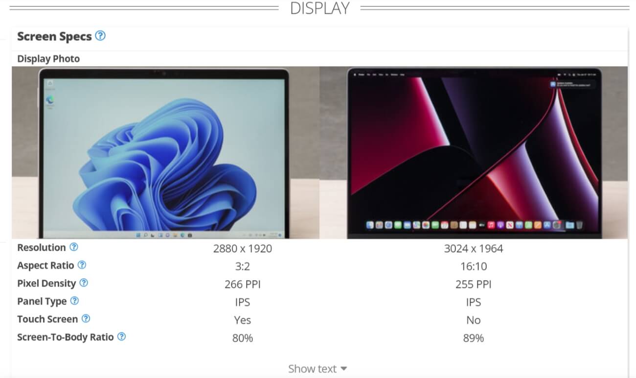
You’ll note that Rtings.com doesn’t include any commentary about the differences. Instead, they opt for a more visual approach with specs that they assume will speak enough for the reader.
Our take? While the comparison looks super clean, this isn’t the best approach to a product comparison. Readers want to imagine themselves with the product, and for a beginner techy, an 80% vs. 89% screen-to-body ratio might as well be Greek.
Instead, we recommend explaining the key differences and how they’d affect the user.
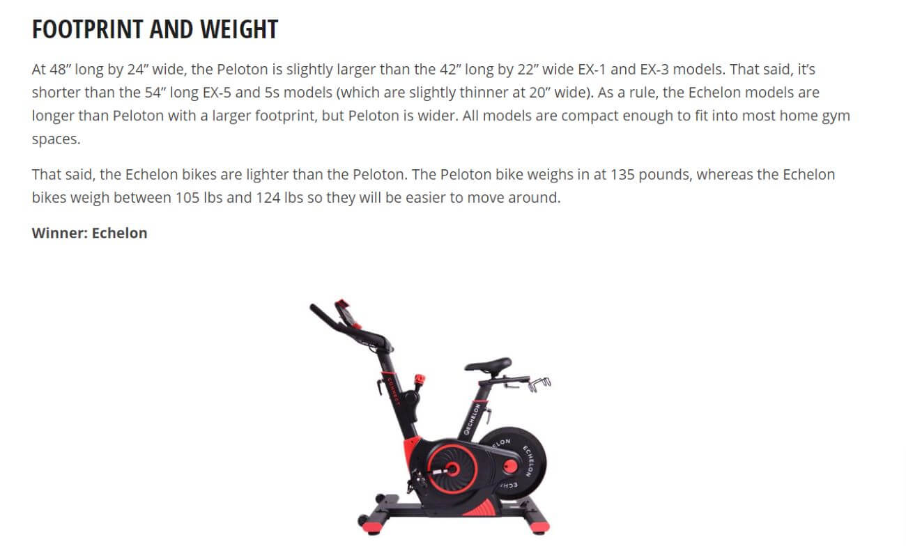
Sports Illustrated has similar sections in this product feature comparison for resistance, weight capacity, display, pedals, and more. Notice how clearly the writer demonstrates what each product looks like for the qualifier (dimensions) and the effects on the consumer reader (e.g., ease of movement, spatial considerations at home).
We also love the “winner” line to show the reader which is the superior product for each category.
Product pros and cons
After your comparison chart, get into your product highlights and drawbacks. You should make these skimmable, ideally with bolded words to indicate each pro with accompanying copy.
Here’s a great example from GearPatrol:
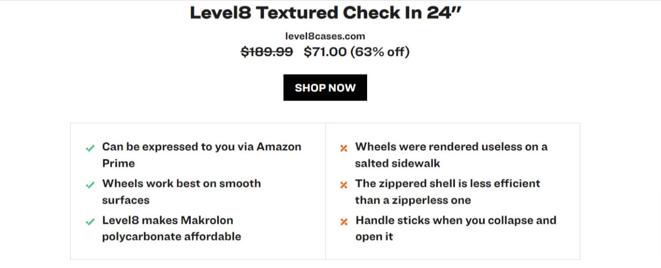
Skimmable, clear, and super informative!
TL;DR section
Hang on, didn’t we already cover the comparison table? Yes, but your audience still wants a concise summary (no more than two lines) to help solidify their choice. This should come at the end of your product comparison content section.
Think of this as the frank advice you would give to a friend. Maybe you traveled to Amsterdam, and you want to share your opinion on the best hostels. You might say:
- “If you like X, go to this hostel.”
- “If you like Y, go to that hostel.”
Let’s see this concept in practice:

MarketingSatchel opts to place this TL;DR right before a product comparison chart. Fine by us! In two sentences, they sum up the main difference between the two learning platforms for the reader.
We’ve seen lots of equally great product comparison articles with a TL;DR as its own header or TL;DRs within the conclusion. Both work fine, as long as the sum-up is clear.
6. Buyer decision-maker conclusion
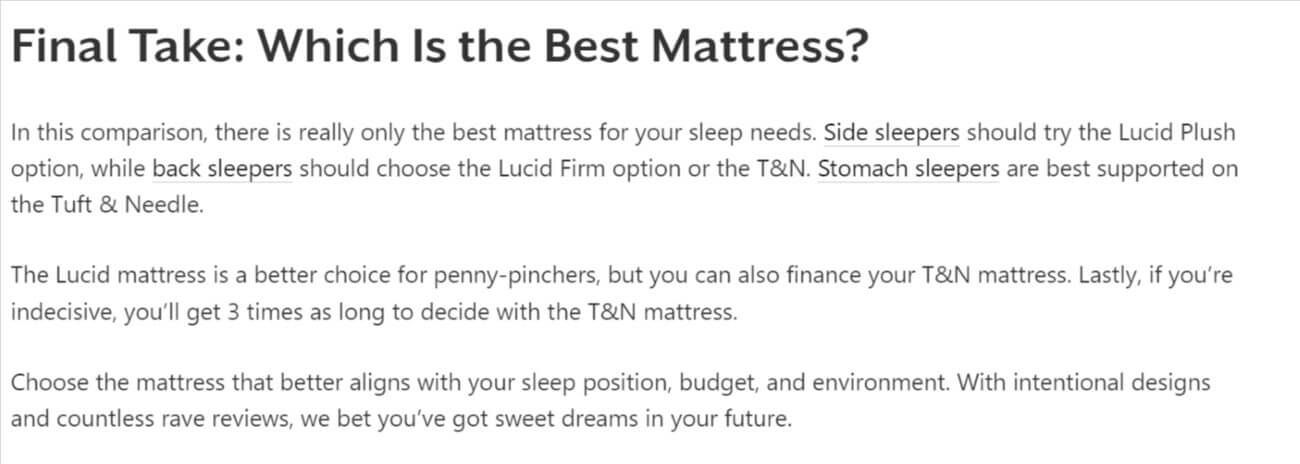
So, which product is your reader buying? Hopefully, they already have an idea; but your conclusion should reinforce that idea.
The cleanest way is to add a line or two pointing out the main benefits or drawbacks of each product. You might err on the side of caution and keep the recommendation open-ended rather than adding your personal preference.
How to write a product comparison that converts
Now that you’re prepped on our product comparison template, you’re tempted to start typing. Not so fast! First, you’ll want to:
1. Set a goal for your product comparison
Marketing manager Dominik Schröder conducted a “design thinking workshop” with his team before drafting his firm’s product comparison articles. They discussed:
- Audience personas
- Content goals
- Product idea brainstorming
- Customer journeys
- UX elements
We suggest similar prep – even if it’s just with yourself – for your product comparisons. Think about what you want to achieve with your content and how you’ll get there.
Will you used these decisions? They should be influenced by your keyword and audience research:
- Alternatives product comparisons (e.g., Caudalie’s moisturizer against 5+ alternatives)
- 2+ more products of different types (Caudalie’s moisturizer vs. Caudalie’s serum)
- 2+ brands (i.e., Caudalie vs. La Roche Posay)
- 2+ products from different brands (Causalie’s moisturizer vs. La Roche Posay’s moisturizer
- 2+ products from the same brand, updated (Caudalie’s 2020 moisturizer vs. 2023 moisturizer)
2. Choose products to compare
Now for your products. How do you pick ones your audience would actually consider buying? Using products they’re already buying is a great starting point. But you can also gather product ideas from:
- Audience social media and surveys
- Google and keyword research
- Amazon
- Competitor blogs
- Products you love
- Products from existing partners
Luciano Viterale, growth consultant for entrepreneurship and marketing website LucianoViterale.com.
You can always review the keyword data in the standard tools to find products to compare.
However, I’ve recently found that when I write a ‘best X’ article I see terms in the search console ranking for the roundup article such as ‘X vs X.’
Here are some tips to ensure audience trust when they read your product comparison:
- Assess seller/partner reviews for any negative experiences.
- Always add an affiliate disclosure
- Pick products of varying price points (or price points you know your readers can afford).
- Show evidence that you’ve used the product (more on that later).
3. Build a product rubric
High school may be over but that doesn’t mean nobody is marking up your work.
Instead of the teacher’s red pen on your essays, it’s your audience who is marking up your product assessment criteria.
A rubric is just a way to evaluate a product’s performance. What criteria is important to you and most importantly, your audience? Of course, criteria vary depending on the types of products you’re comparing.
Say you’re comparing hotels in Bali. You might evaluate your picks based on:
- Price
- Size
- Location
- Reviews
- Comfort
- Amenities
- Perks
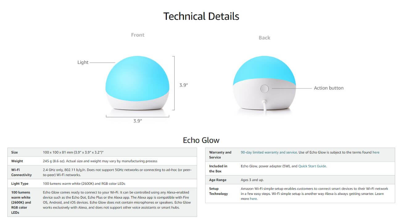
If you need rubric inspo, Amazon is the place to look. Here’s a fabulous example of their Echo Glow rubric:
4. Test and compare products
Don’t expect your audience to convert if you’re just regurgitating other people’s reviews. Sure, product research is a must – but you’ll dramatically increase the chance of conversion if you actually try the product yourself.
If you’re a travel blogger, that might look like adding a pic of you at the restaurant you’re reviewing.
If you’re a tech gadget reviewer, that might be a personal story about your experience with the software.
Look to Wirecutter for a strong example:

Once you test out the products, aggregate the data based on your rubric from step #3. But don’t be nervous if you hate one. Your audience deserves your honest experience – just be tactful so as not to upset your partners. This might look like finding an ideal audience for a product that you might not like. For example, a cheap shirt from Amazon that shrinks on the first wash could still be a solid product for the budget buyer on a backpacking trip.
5. Create product comparison content following our template
OK, now you’re ready to start writing. Use our template and start filling in the blanks.
Keep your copy:
- Honest but not biased
- Comprehensive yet concise
- Engaging not fluffy.
- Balanced not hemmed to one product
Looking for more tips on writing affiliate content? Check out our blog’s resources for more inspiration:
6. Drive traffic to your product comparison
SEO and social media are your product comparison template’s best friends for traffic.
Susan Anderson, founder and lead editor of The Worthy Goods (TWG), swears by social media as a “powerful tool” to gain traffic:
Partnering with relevant influencers and using targeted hashtags can help you establish credibility and promote your content.

TWG uses diverse influencers and product testers to reach their audience. We love how all their social media models and influencer partners span different genders, age groups, and ethnicities.
Psst: Don’t let TWG’s low follower count fool you – they’ve more than doubled their web traffic in the last three months!
Another social media tip? Content repurposing. Your product comparison article is probably super long and juicy. You can take some snippets and create unique social media posts and visuals with them and link back to the blog.
Of course, a strong SEO strategy will be your home run for new web visitors. We’ll give you two delectable SEO nuggets to appeal to Google’s crawlers: buyer-intent keywords and backlinks.
One of our business writers, Natalie Robin, reiterates the importance of both in our 2023 affiliate marketing tips:
Learning how to identify buyer intent keywords is meeting your audience at the end of the buyer funnel – which means they’re more likely to follow through on a purchase.
Still, keywords alone won’t be enough to rank. You need to up the ante with a backlink strategy. Maybe that looks like reaching out to other industry players for a link exchange – or taking the initiative and featuring them first.
Some of the best ways to build links to affiliate content is through Facebook groups and private Slack communities dedicated to link building.
7. Optimize your product comparison after it’s published
New visitors and clicks are pouring in, but that doesn’t mean your work is over. Your product comparison piece is competing with hundreds of others for rankings and conversions.
The best way to keep your content fresh and relevant is by leveraging performance insights.
Ask yourself: Are my product links seeing enough action? Without an affiliate marketing management platform, you might not find a great answer to this without hours of work.
Affilimate’s aggregated link tracking and revenue attribution will tell you exactly how much money each link brings.
If you notice a dip, it might be time to update the article with a new product. You’ll feel at ease knowing you can track the revenue and traffic impact of any revisions to your content with Affilimate, too.
What are the signs of a winning product comparison article?
Product comparison posts give you ample opportunity to convert readers – but you need to put in the work to see conversions. What separates winning product comparison posts from clickbait?
The data shows that affiliates with Affilimate’s product comparison template are getting the most traffic and conversions. That’s because our tool’s many features help them attract and maintain a loyal customer base.
Whether it’s heat maps to identify high-converting web elements or link management to visualize revenue, Affilimate arms you with the confidence and knowledge to improve your affiliate business and surpass your revenue goals.
To take your affiliate marketing to the next level, try our 15-day free trial today!

